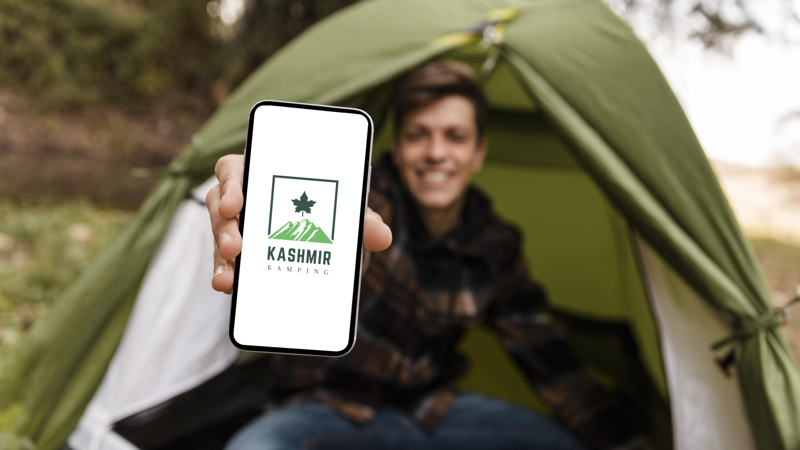
The logo for Kashmir Kamping was designed based on the client’s request to feature a prominent leaf symbol within a square box. The leaf represents nature and sustainability, highlighting Kashmir's natural beauty, while the square box adds a modern and structured look. A color palette of earthy greens and browns was used to evoke harmony with nature, complemented by neutral tones for balance and professionalism. The typography is clean and approachable, ensuring readability while aligning with the brand’s eco-friendly and reliable identity. This design seamlessly combines aesthetics with functionality to reflect the brand's core values.